
Workplace Safety & Insurance Board
Online Expense submission
Project Overview
The WSIB Expense Submission Modernization project was part of a broader transformation initiative to uplift WSIB's digital services for people with workplace injuries. The goal was to transition an outdated, paper-driven expense reimbursement process into a seamless online experience.
From a business perspective, the challenge was clear:
“The existing process created operational bottlenecks for internal payment teams and frustration for users who lacked visibility into their reimbursement journey. Multiple disconnected forms, inconsistent requirements, and manual backend handling caused avoidable delays, confusion, and high volumes of support calls.”
The problem
The WSIB Expense Submission Modernization project was part of a broader transformation initiative to uplift WSIB's digital services for people with workplace injuries. The goal was to transition an outdated, paper-driven expense reimbursement process into a seamless online experience
A fragmented system causing frustration on all sides
User groups and their pain points
The expense submission process serves multiple user groups, each with distinct pain points and emotional pressures:
Evidences of the problems
The user interviews, patterns observed across teams, and past submission channels highlighted recurring issues:
High rates of incomplete or inconsistent submissions
Increased processing time due to manual validation
Failure of previous online attempts due to unclear requirements and poor error handling
Frequent user inquiries seeking confirmation, status updates, or guidance
Human-centered problem statement
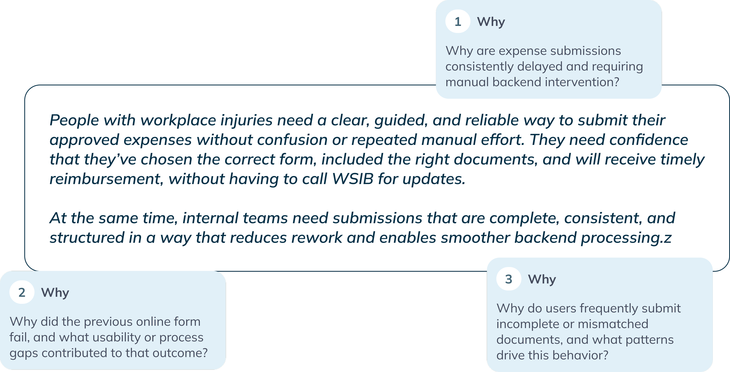
To uncover root causes, we conducted deep-dive discussions with business, payment teams, and technology partners and framed core “why” questions:
Approach
A research-driven, iterative process

We followed a research-driven approach focused on understanding both human experience and operational realities.
Why This Approach
Although we had a general understanding of the existing problems, many details depended on backend workflows, data rules, and future integration plans. A research-led process ensured we captured these nuances, validated assumptions, and designed an experience that worked for both users and internal teams.
Discovery
WSIB received thousands of expense submissions each month across six different types. mostly through PDF forms and fragmented uploads. Users struggled to submit complete information, and the payment team faced heavy manual workload.
To understand the full ecosystem, we conducted Analytics review with UX researchers to examine volume by form type, processing timelines, Stakeholder and internal team interviews, led by me, with healthcare and RTW payment managers, payment representatives, and drug verification teams to observe real processing workflows and Heuristic evaluation of the existing online form and PDF processes and Form and process workshops to document current vs. desired states.
Understanding the full ecosystem
Users uploaded forms and supporting documents separately, making matching and processing time-consuming.
Key Pain Points Identified

Mileage checks, route verification, prescription details, and eligibility confirmations were done manually.
Users often submitted expenses without prior approval or missing required documents.
Recurring expenses required re-entering identical information multiple times.

Payment teams manually routed forms and created follow-up letters.
Users frequently called for status updates or denials due to unclear requirements.
Key insights
- Users prefer to submit multiple trips at once
- Eligibility confusion causes denials
- Manual mileage calculation is error-prone
- Documents submitted separately
- Recurring travel patterns need reuse
Design responses
- Introduce bulk entry
- Guide users based on approved travels
- Integrate a map-based calculator
- Require documents before moving forward
- Allow reuse of previously submitted details
Key insights
- Reading prescriptions/receipts is difficult for users
- Must upload both prescription + receipt
- Manual distribution to payment reps is inefficient
- Manual pre-expiry letters for ongoing medications
Design responses
- Use OCR + smart field recognition
- Enforce dual-document upload in flow
- Enable automated routing based on metadata
- Automate expiry timelines and renewal reminders
Key insights
- Users struggle with clinical questions
- Repeated back-and-forth communications
- Information should come from providers, not users
Design responses
- Shift primary submission to provider portal
- For user-initiated: receipt + prescription upload only
- Use OCR extraction to reduce errors
Key insights
- Catch-all category causes confusion
- Users select wrong form or are unsure where expense belongs
- Difficulty locating provider details
Design responses
- Create dedicated healthcare expense entry point
- Simplified receipt + prescription submission
- Smart search with prepopulated provider directories
Key insights
- Wide range of expenses (courses, travel, accommodation)
- Generic form forces users to guess requirements
- Users often submit multiple expenses separately
- High-value expenses require prior approval
Design responses
- Enable multiple expense types in single flow
- Tailored mini-forms based on expense type
- Make approved services visible from worker plan
- Receipt-first with auto-extraction
Key insights
- Many ineligible submissions received
- Users unaware of renewal timelines
- Application rarely changes year to year
- Manual eligibility rate calculation
Design responses
- Enable review and reuse of previous applications
- Automate eligibility calculations
- Provide real-time clarity on approved amounts
Early Themes & Hypotheses
Our deeper dives into specific form types surfaced additional insights:
Research
Deeper research insights
User Observations & Behavioral Patterns
- Users—many older or recovering—struggled to repeatedly transcribe information from receipts.
- Interpreting medical and financial information created cognitive load during recovery.
- Users lacked tools to reuse previous entries for similar expenses.
- Fear of incorrect input or missing documents led to hesitation and support calls.
System & Interface Observations
- Lack of guided steps caused confusion about required documents.
- Minimal inline validation increased incomplete submissions.
- No integrated calculation tools (e.g., mileage).
- Rigid form structures did not adapt to user context.
Cross-Team Insights
- Customer Support: High call volume related to eligibility and approval status.
- Payment Operations: Manual document matching and validation slowed processing.
- Engineering & Technology: Legacy systems limited automation opportunities.
Across all perspectives, one theme was consistent:
The existing expense submission process places too much responsibility on the user to interpret rules, complete calculations, and understand eligibility, while internal teams carry the burden of correcting and reconciling errors.
Definition
Based on our research and the insights gathered, we defined the core problems and began ideating on solution directions. Through multiple rounds of iteration, collaboration, and validation, we refined the experience into a set of clear, user-centered flows.
The following sections present the solution architecture, user flows, and the wireframes that emerged from this iterative design process:
Solution overview and flow
Establishing the Right Placement in the Information Architecture
Users struggled to locate the correct forms within WSIB’s online services. Through card sorting and IA workshops, we introduced a Financial Hub with two subtabs:
Benefit Payments – for viewing recurring WSIB payments.
Expenses & Reimbursements – for reviewing past submissions and submitting new ones.
This clarified where users manage payments versus where they claim expenses.
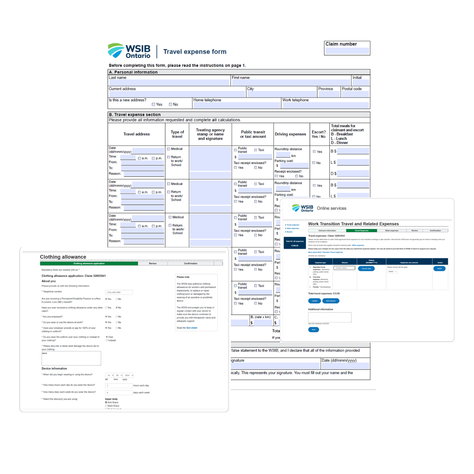
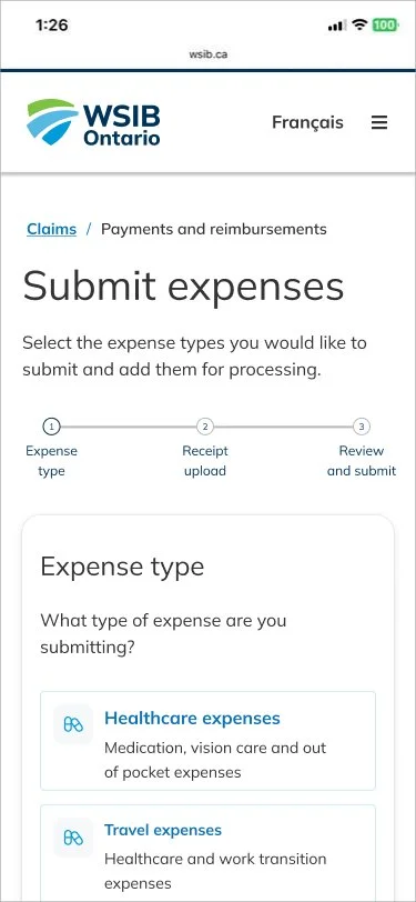
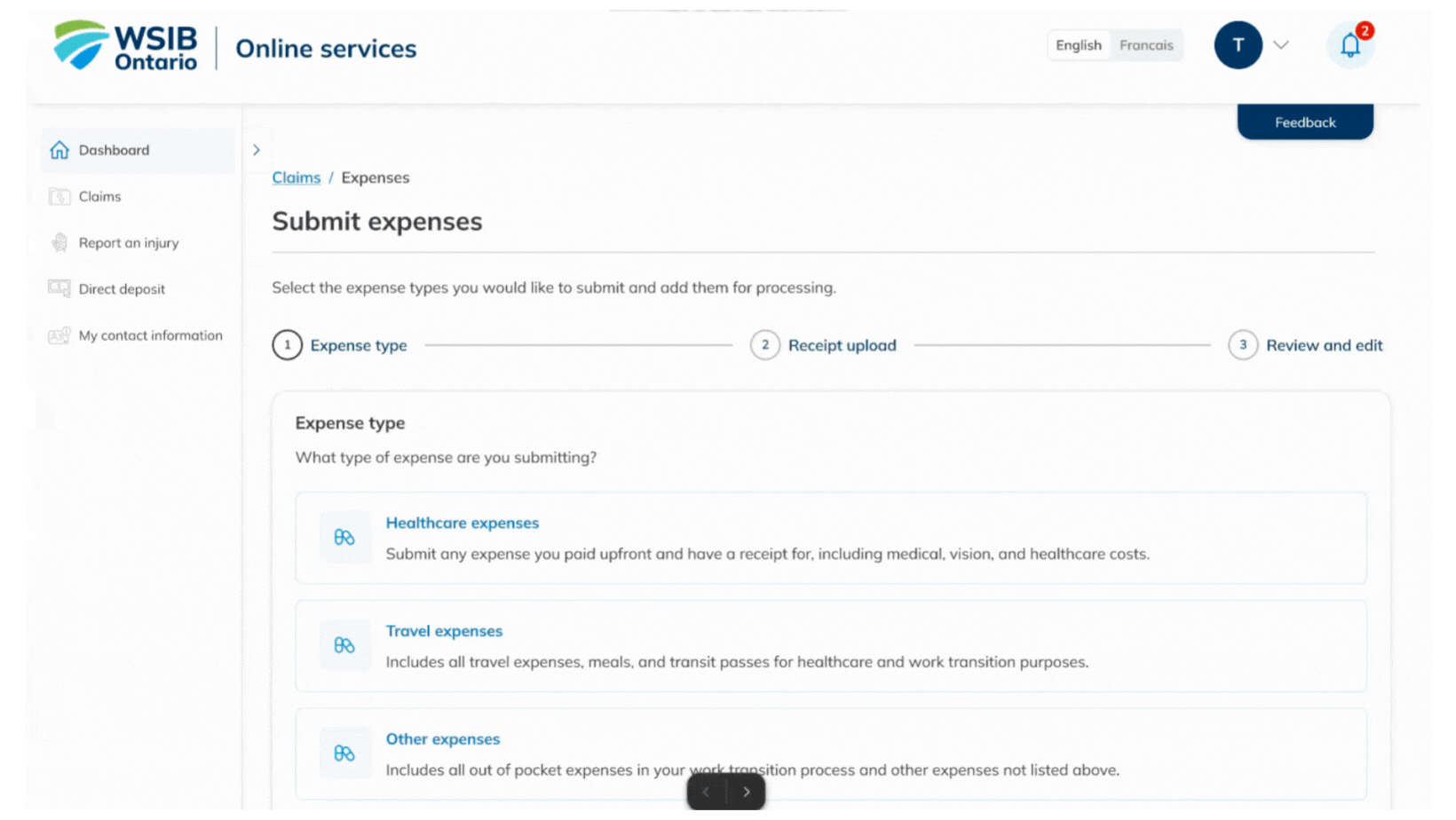
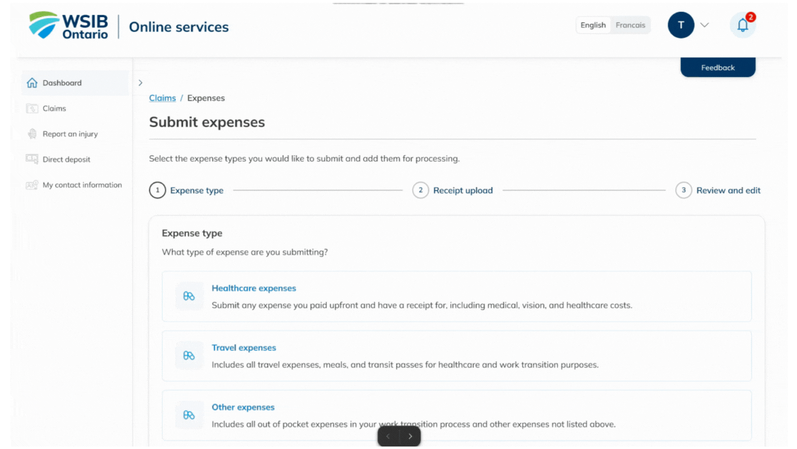
Unifying Six Forms Into Four Clear Categories
To reduce confusion and repetitive entry, I audited all forms and backend rules, consolidating six forms into four intuitive categories:
Healthcare Expenses (receipt/prescription-based)
Travel Expenses
General RTW Expenses
Clothing Allowance
This simplified decision-making and created a single, predictable starting point.
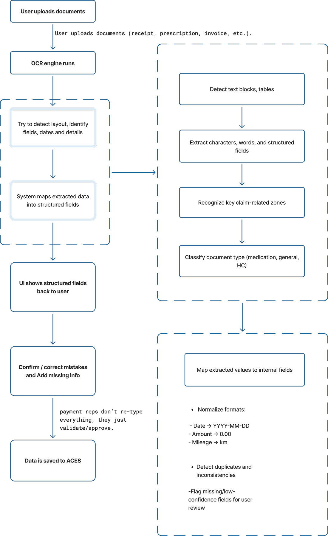
Introducing OCR to Reduce User Effort and Errors
We transformed lengthy forms into receipt-first submissions using OCR/ICR to extract key details (DIN, provider info, dates, amounts, etc.).
OCR Flow: Upload → Detect → Autofill → User Confirmation.
This reduced manual entry, improved accuracy, and lowered follow-up effort for internal teams. A mandatory review step ensures data correctness before submission.
Design
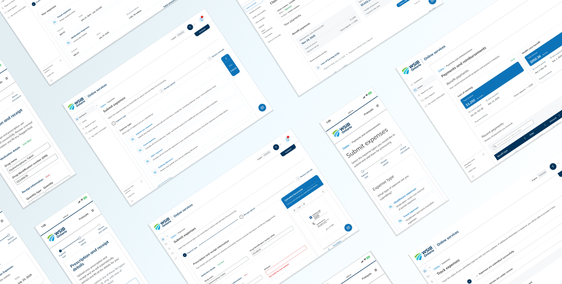
After multiple iterations, stakeholder reviews, and usability testing, the final solution centered on a unified expense submission experience with bulk submission capability and a real-time reimbursement tracker. This design gave users greater control, reduced repetitive effort, and significantly minimized processing delays for internal teams.
I began by surfacing the most important information upfront. The landing page now displays users’ latest WSIB payments and recent expense updates, with clear CTAs linking to detailed views. This creates immediate clarity and reduces the need to navigate multiple sections.
Solution overview and flow

To streamline navigation, the payment section includes two subtabs:
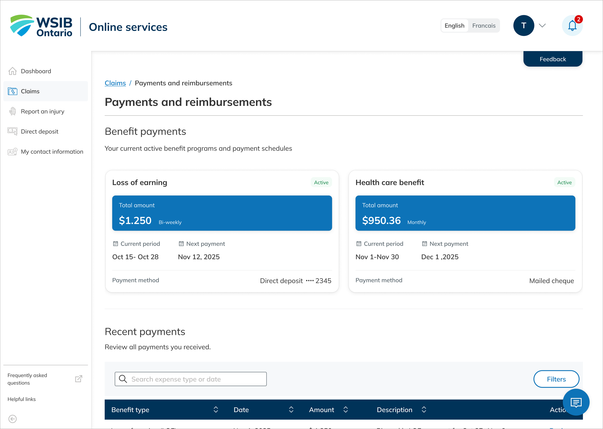
Benefit Payments
Shows recurring WSIB payments with key details like benefit period and payment method.
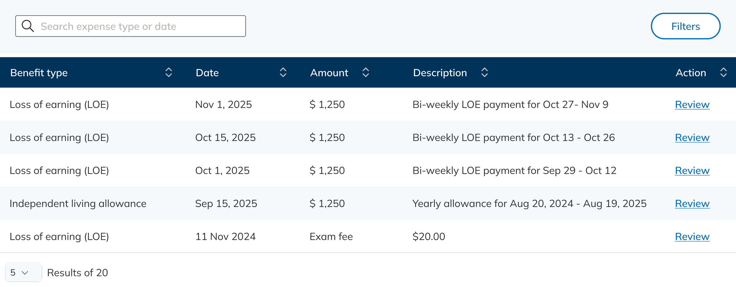
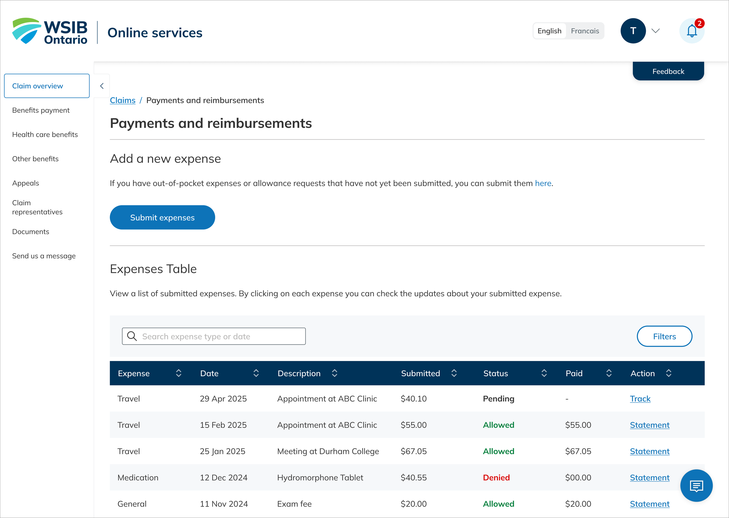
Expenses and Reimbursements
Previous a full history of reimbursed expenses, including status, amount, and description, along with a clear entry point for submitting new expenses.
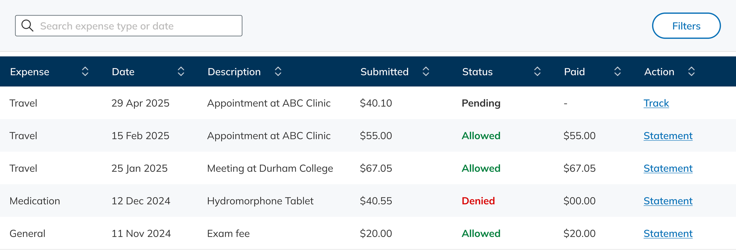
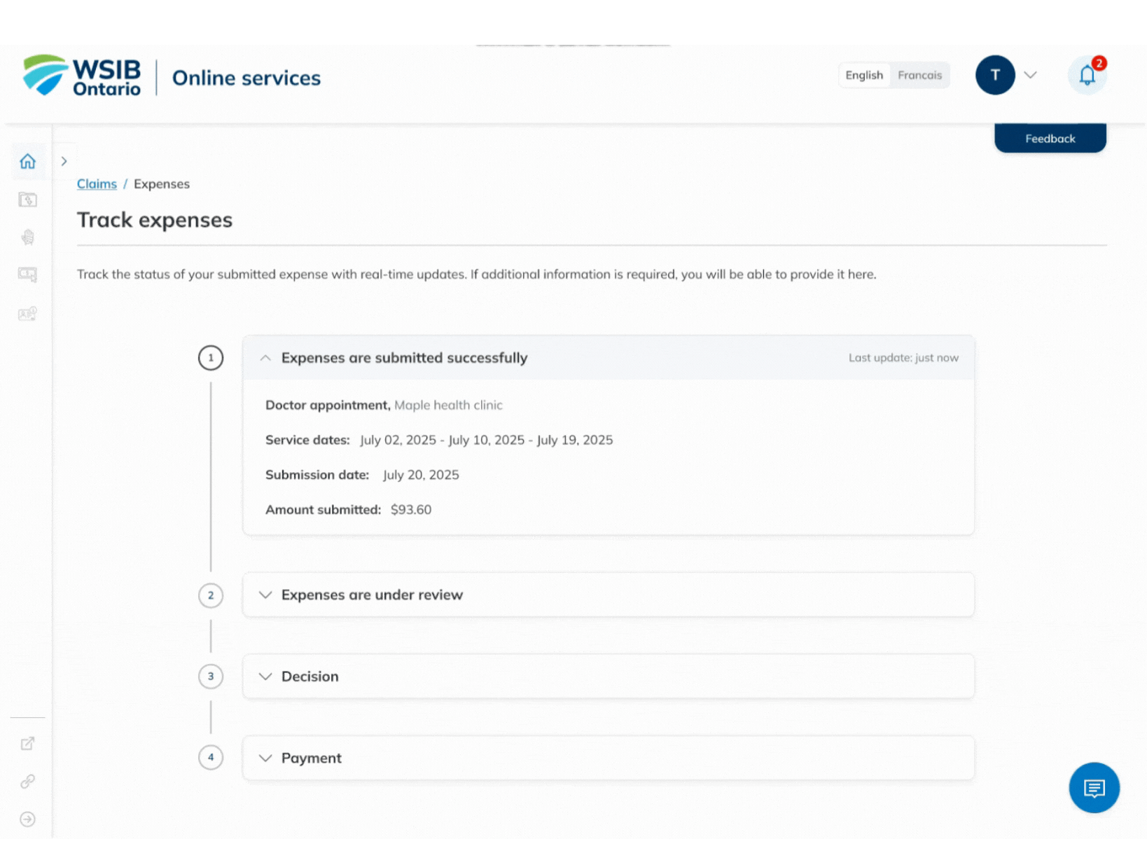
In response to high inquiry volume and user complaints, we introduced a Reimbursement Tracker. Users can now view real-time status updates, including when additional information is needed, reducing uncertainty and support calls.
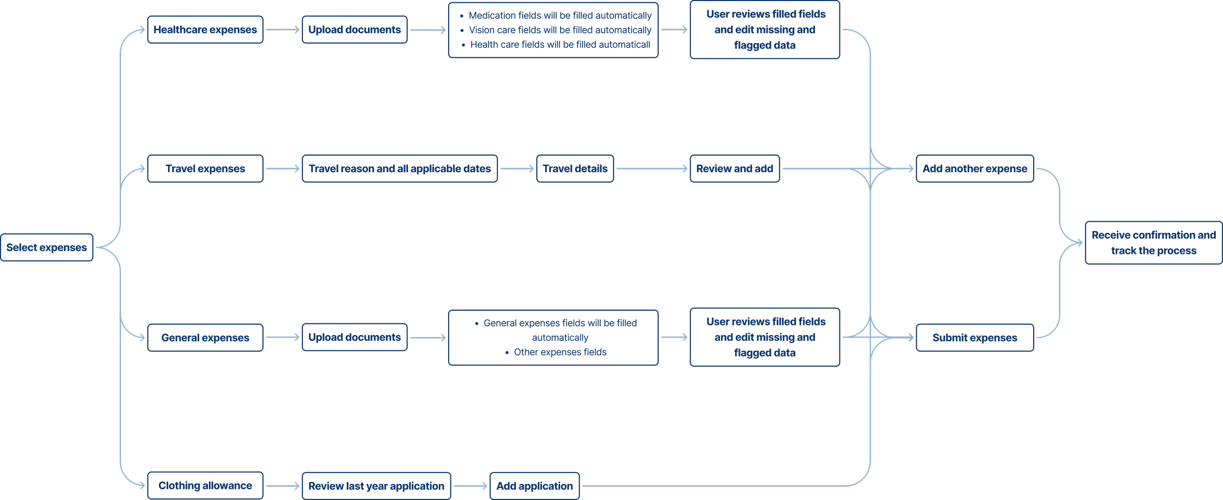
Unified, Guided Expense Submission Flow
The redesigned submission flow guides users through a consistent step-by-step process across four categories: Healthcare & Medication, Travel, General RTW expenses, and Clothing allowance.
For receipt-based expenses, users upload documents and WSIB’s OCR engine extracts key details directly into the form, reducing manual input and improving accuracy.

OCR Technology
Working closely with IT, we defined extraction rules and mapped required text blocks. The system identifies relevant data, auto-populates fields, and then prompts users to review and confirm accuracy before proceeding.
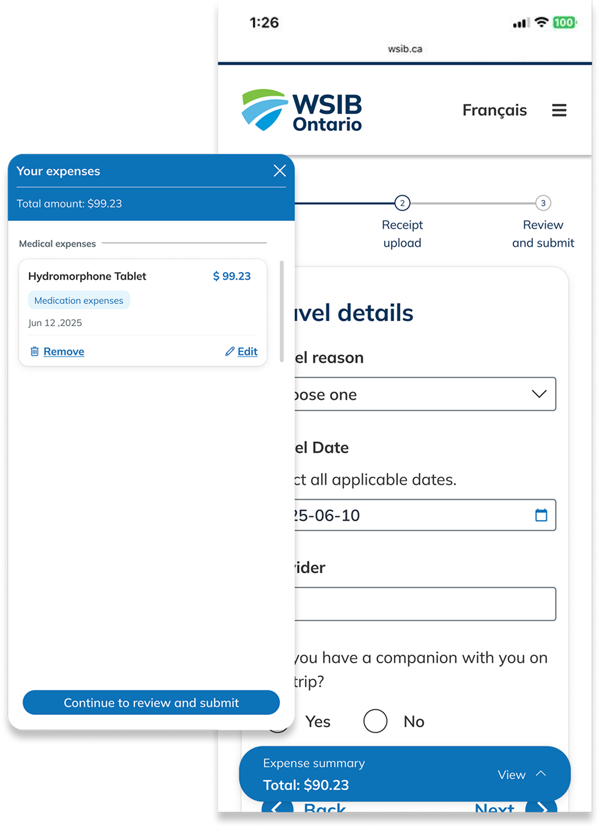
Users can add multiple expenses in one flow. To support this, I designed a collapsible Expense Summary Panel, allowing users to review, edit, or remove entries while tracking totals.
The flow supports adding expenses from different categories sequentially—for example, submitting healthcare expenses first, then adding travel expenses tied to the same visit. This reflects real user scenarios and reduces form repetition.
Bulk Expense Submission & Summary Panel
This feature reinforces trust and reduces submission errors, especially for users entering multiple recurring expenses.
The collapsible expense summary panel provides users with a clear overview of all added expenses when submitting multiple items. It allows them to easily review, edit , or remove entries before final submission, increasing transparency and confidence throughout the process.
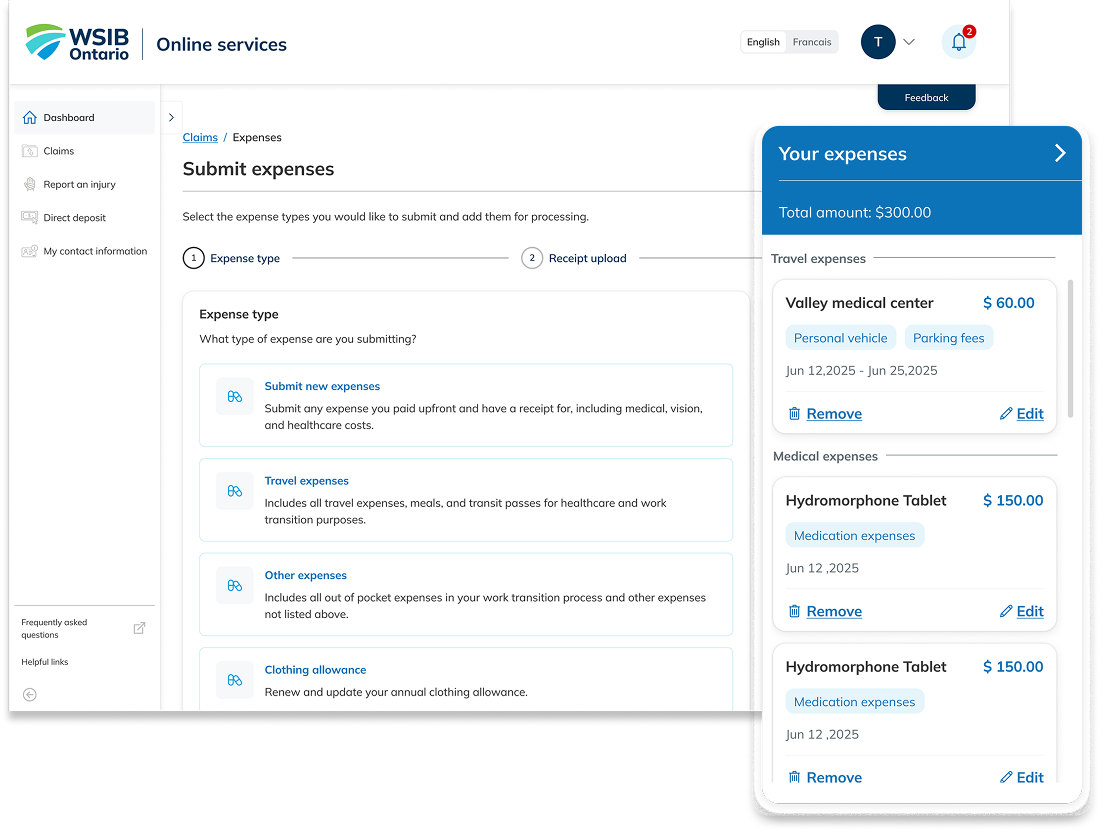
For mobile layout, once users add their first expense, a fixed bottom summary panel appears. This persistent element keeps the total amount and added expenses visible at all times, giving users grater control and awareness as they continue adding additional items.
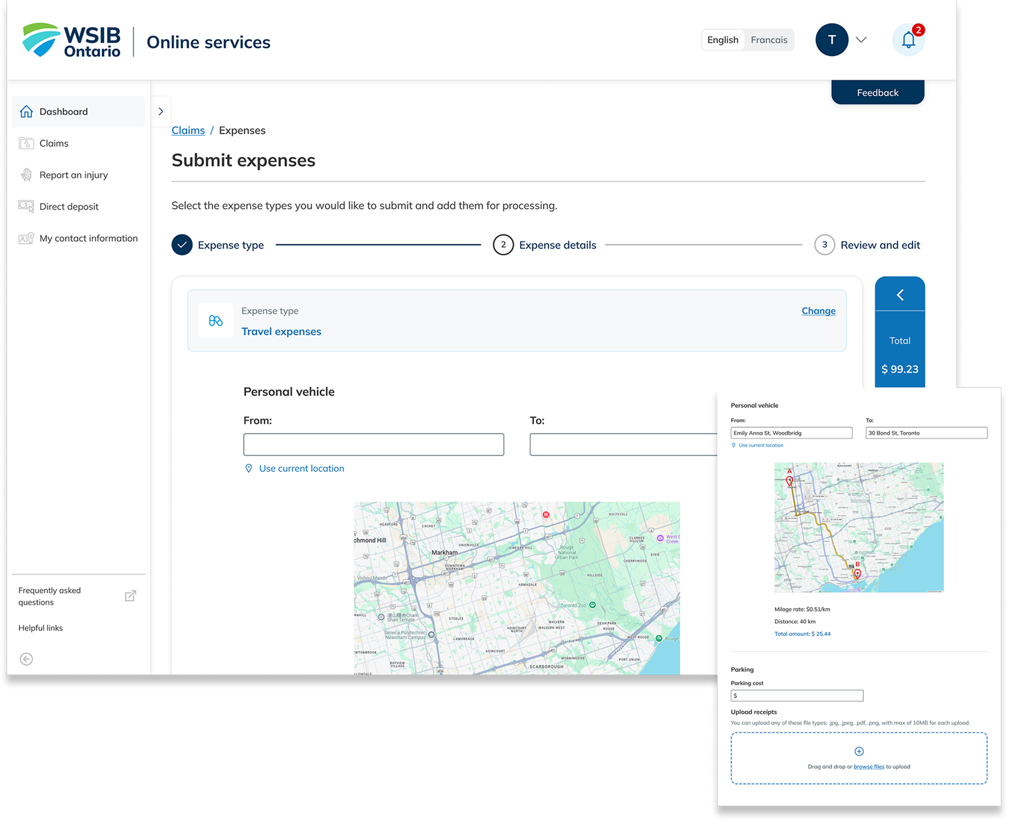
For travel expenses, users can enter a start and end points, and the system automatically calculates total reimbursement using milage rate and distance data sourced from Google Map. This removes the need for manual calculation and ensures accuracy for both users and payment teams.
Clothing allowance application
For Clothing Allowance, which requires an annual application, we enabled users to start with their previous year’s submission. Once they update their answers, the form dynamically adjusts based on conditional logic, and any required device information is prepopulated for review. This reduces repetitive entry, minimizes errors, and streamlines the renewal process.
Test and refinement
Usability Testing & Accessibility Checks
After validating the designs against WCAG and internal accessibility criteria, we conducted usability testing with real users, including participants with disabilities. The sessions confirmed strong satisfaction with the bulk-entry flow, while also revealing opportunities to refine the summary panel for clearer readability and interaction.
Participants using assistive technologies highlighted challenges with font hierarchy and screen reader navigation. Through close collaboration with accessibility specialists and development teams, we resolved these issues, ensuring the final experience was fully usable and inclusive across devices and abilities.